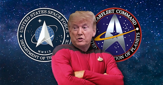
The logo for Donald Trump’s new US Space Force looks very familiar
Donald Trump appears to have boldly gone where Star Trek went before after unveiling a strikingly familiar logo for his new US Space Force.
The US president unveiled the design on Friday, saying that he that he had consulted with military leaders and designers before presenting the blue-and-white symbol.
It features an arrowhead shape centred on a planetary background and encircled by the words ‘United States Space Force’ and ‘Department of the Air Force.’
However, social media was quick to point out the uncanny resemblance to Star Trek’s Starfleet Command.
George Takei, who played Mr. Sulu in the original ‘Star Trek’ TV series and films, tweeted: ‘Ahem. We are expecting some royalties from this.’
The logo, which bears the date 2019 in Roman numerals, is also similar in design to that of Air Force Space Command, from which Space Force was created by legislation Mr Trump signed in last month.
Space Force is the first new military service since the Air Force was created in 1947.
It is meant mainly to improve protection of US satellites and other space assets, rather than to put soldiers into orbit to conduct combat in outer space.
The idea became a regular applause line for Mr Trump at his political rallies. He originally wanted a Space Force that was ‘separate but equal’ to the Army, Navy and Air Force, but instead Congress made it part of the Department of the Air Force.
The President boasted on Twitter yesterday: ‘After consultation with our Great Military Leaders, designers, and others, I am pleased to present the new logo for the United States Space Force, the Sixth Branch of our Magnificent Military!’
Home › News › WorldSource: metro.co.uk

